


OS X Daily: “Change the Animation Speed of Hiding & Displaying the Mac OS X Dock” plus 2 more |  |

- Change the Animation Speed of Hiding & Displaying the Mac OS X Dock
- Making Sense of Mac Keyboard Symbols
- Use iBooks Themes to Improve the Reading Experience on iPhone & iPad
| Change the Animation Speed of Hiding & Displaying the Mac OS X Dock Posted: 28 Mar 2012 09:42 AM PDT
Automatically hiding the Dock is one of the more useful features you can enable if you work on a Mac with limited screen space. That experience can be improved by removing the auto-hide delay from the Dock in OS X, which reduces the delay from when a mouse is hovered near the Dock to when it’s displayed, but now we’ll show you how to speed up or remove the slide-in and slide-out Dock hide and show animation itself. Remove Dock Animation CompletelyFirst up, removing the Dock animation completely, this makes an auto-hiding Dock snap into place immediately. Launch the Terminal and use the following defaults write command:
The Dock will automatically restart with the changes taking effect. Set an Ultra-Fast Dock Hide & Display AnimationThis leaves the Docks animation intact, but speeds it up dramatically. You can adjust this yourself by changing the numbers after the -float flag:
Restore Default Animation SpeedReturn to the OS X default animation speeds with the following defaults write command:
Thanks to Levi for the tips in our comments!
|
| Making Sense of Mac Keyboard Symbols Posted: 27 Mar 2012 03:38 PM PDT
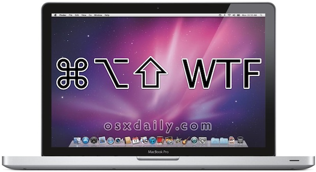
Ever wondered what those Mac keyboard symbols mean and what they translate to? You see them on a lot of Mac keyboards and on plenty of keyboard shortcut lists, looking like strange glyphs (⌥), shapes (⇪), and bugs splattered on windshields (⌘). They can be fairly confusing, which is why we at OSXDaily.com always try to manually write out the key itself. Using the name of the key is becoming the norm on newer Apple keyboards, but many pre-2011 Macs have keyboard symbols on keys, and with really old Macs you get all symbols with no labels. Additionally, you’ll find the symbols in drop-down menus throughout OS X, so what the heck are they in plain english? ⌘ is the Command () key⌃ is the Control key⌥ is the Option (alt) key⇧ is the Shift key⇪ is the Caps Lock keyfn is the Function keyNow you know, but if the symbols confuse you, don’t feel too bad about it. I’ve been using Macs since I was a little kid and the Option and Control key symbols have always perplexed me to the point where I’ll forget which each is, and that is precisely why Apple is gradually moving to the labeled keys rather than symbol keys. Simple is better. The above list is the standard keyboard symbols for most keyboard shortcuts, below is a more complete list of some of the symbols that appear elsewhere in menus and the keys they map to. Thanks to Lri for posting these secondary symbols in the comments. Full Keyboard Symbol List:
|
| Use iBooks Themes to Improve the Reading Experience on iPhone & iPad Posted: 27 Mar 2012 01:06 PM PDT
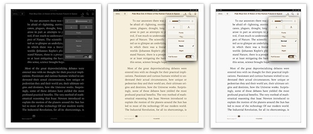
The iBooks app includes three different color themes that can be used at different times of day to improve the reading experience. Accessing the themes is easy:
Normal shows classic black text on a white background, this is great for mid-day reading when the ambiant lighting is brightest, but later in the day it can be harsh on the eyes. Sepia offers dark brown text against an off-white background, making it perfect for dimmer lighting in early mornings or evenings when the surrounding light isn’t quite as bright. Night is light grey text on a black background, which is ideal for reading in the night time in darker rooms. Not only is it easier on the eyes, but the inverted screen colors stop the iPhone or iPad from illuminating the rest of the room like an artificial lamp, making it less obnoxious if someone in the same room is trying to sleep. You can also take the Night theme concept system-wide by inverting the iOS screen, making it easier to read web pages and use other apps in the darkness. The Sepia theme is probably the best all-around choice to use if you don’t want to be tweaking themes throughout the day. Use it in combination with adjusting the screen brightness and you can read comfortably in just about any lighting conditions. The dimmer the surrounding light, the lower the brightness should be, this makes it easier on the eyes and has the added benefit of improving battery life of an iPad or iPhone.
|

| You are subscribed to email updates from OS X Daily To stop receiving these emails, you may unsubscribe now. | Email delivery powered by Google |
| Google Inc., 20 West Kinzie, Chicago IL USA 60610 | |
0 comments:
Post a Comment